

Help teacher create assignment
Revamp the assignment creation process for teachers on a legacy education platform
Time
Oct, 2019 - May 2020
Team
2 Designers
4 Engineers
1 Product Manager
My Role
-
Redesigned the UX & UI & design system
-
Explored & implemented new UX concepts and features
-
Facilitated design discussion with PM and engineers

Redesign outcome
01 Dashboard
On the dashboard, the teacher can manage his classes and assignments or create new assignments.

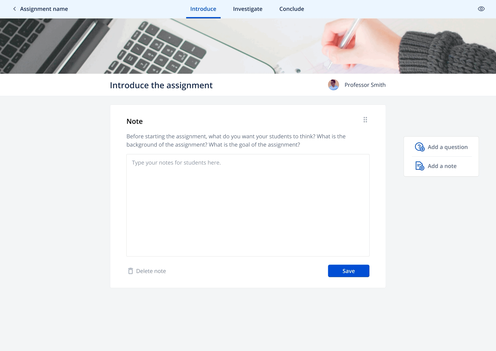
02 Introduce and Conclude
The teacher is now able to write notes and add questions to introduce or conclude the assignment, which enhances student learning.
03 Questions on live web sources
The teacher is also able to insert a URL (web source) and drop questions to create an interactive reading exercise. In this way, students can answer the questions in a contextualized manner.
Users & challenges
Our target users are teachers of different ages with different technology literacy. For example, this is Helen.
The assignment structure, which has been determined by previous research is complex.


How might we get Helen onboard with assignment creation?
Design Proposal
1. An assignment overview page
If teachers have a better understanding of the content structure prior to editing, they will have better control and make less mistakes.

Through exemplar collections & internal discussion, we learned about users' need and iterated on the three section cards.
V1
V2


I proposed to add icons to help teachers better differentiate the three cards. We signed off on version 3.1 for empty status.
V3

V3.1

Here is the outcome of the assignment overview page.
Empty Status

After filling the content

2. A progress bar in the editor
When users click into the card, they enter the assignment editor. We proposed to add a progress bar on the top to navigate teachers.

Here is the outcome of the progress bar in editor.

Hand off the flow

Technical constraints
After we shipped the assignment creation flow, developers encountered some technical difficulties. When teachers put the questions pin on the web resources, the relative positions of the question pins need to be recorded. However, it is difficult depending on the sizes of browsers.

After discussion, we learned that one solution is to let instructors scroll down to the bottom of the article first to measure the length. This way, the developers can record the relative positions of the question pins. Therefore, from design side, we designed an onboarding experience to guide users to scroll down before adding questions or comments. The followings are the three basic steps for the onboarding experience.

To ensure the tooltips are carefully observed by instructors (especially for the step of scrolling down), we separate the single step of measuring article length into two parts. To let users know what they need to do and confirm that they have done it.

Usability Test
Before implementation, we proposed to conduct a usability test with instructors. We crafted a testing plan and brought our interactive prototypes to five participants.


After analyzing our observation and instructors' feedbacks, we presented our usability test report to the team. Regarding the overall experience and assignment structure, all 5 instructors provided positive feedback as the picture shows; therefore, validating our new design's improved functionalities to address the problems identified in the original design.

Iterations
Before
Two out of five instructors were confused about where to put the web URL in the first step due to distractive illustrations and tooltips in the background.

Before
From usability test, teachers mentioned that they wanted to make sure the content is correct before publishing the assignment. Also, teachers didn't notice that they could add multiple activities.

After
We removed the border of the illustration, designed an overlay to assist users focus on the tooltip, and added a blue circle on the bottom bar as a visual aid.

After
Preview of notes & question added to let teacher check the content before publishing. A big CTA is added to guide teachers to add multiple activities.

Design system


Impact and reflection
Achieve the goals
According to the user research, our users can complete their tasks smoothly with our design.
Cope with uncertainty
Due to technical difficulties, not all product ideas can be implemented ideally. Therefore, we actively propose alternatives and discuss within our design team to cope with uncertainty and to ensure the process moves forward according to our product roadmap.
Never settled
Product design is an iterative process. As a passionate designer and avid learner, I strive to improve my design with each iteration through peer-review and self-critique. Even when other members of the team think our design is ready for testing, I continue to work for a better version.